Brand Video Pro · brandvideopro.matewishkey.com

The site is doing the brand a disservice. Here's the proof, and five ways out.

A full audit of the live Squarespace site, then five design directions built from his own photography, colours and type — each one a real page you can scroll, not a mood board.

Measured 19 Sep 2026 Lighthouse 13.5.0 Pages crawled 31 Target domain brandvideopro.matewishkey.com

The verdict

Mobile performance is 8 out of 100.

That is the finding everything else hangs off. Chris sends 120,000 Instagram followers to this site from their phones, and on a normal mobile connection the main content takes 29.8 seconds to appear.

8
Performance — mobile
Lighthouse
38
Performance — desktop
Lighthouse
87
Accessibility
Lighthouse
92
SEO (shallow check)
Lighthouse

The single cause: 79 MB of autoplaying background video. The homepage pulls 221 requests totalling 80,938 KiB. Roughly 71 MB of that is Squarespace background-video chunks streamed over XHR — the countryside clips behind the hero and section bands. They look lovely and they are eating the site alive.

Lighthouse's SEO score of 92 is misleading. It only checks the page it loads. The crawl below is where the real SEO problems are.

MetricMobileDesktopShould be
Largest Contentful Paint29.8 s6.8 s< 2.5 sFail
Total Blocking Time5,200 ms630 ms< 200 msFail
Cumulative Layout Shift0.4190< 0.1Fail
Time to Interactive38.3 s6.8 s< 5 sFail
First Contentful Paint4.1 s1.8 s< 1.8 sPoor
Page weight80,938 KiB over 221 requests< 1,500 KiBFail
Server response210 ms< 600 msGood

Lighthouse 13.5.0, headless Chromium 1243, default mobile throttling. Full reports linked at the bottom.

SEO crawl — all 31 pages in the sitemap

Most of the site is invisible to Google on purpose, by accident.

I crawled every URL in sitemap.xml plus the homepage and checked titles, descriptions, headings, alt text, duplication and word count.

High 28 of 31 pages have no meta description

Only /, /blog/want-better-sound and /join-soon have one. Everything else — including /gear, /corp, /audit and /creator — lets Google invent the snippet. Those are the commercial pages.

High Three near-identical homepages

/, /join-now and /join-soon are the same 1,250-word sales page. They compete with each other and split whatever authority the page earns.

  • /join-now ships 1,182 KB of HTML on its own
  • No canonical tying them together

Medium 17 thin pages are indexable

Funnel and redirect stubs sit in the sitemap with almost no content. /links, /start and /fbstart are 6 words each; /rich, /puppy, /howtouseai and /easier are 29 words each and identical.

These should be noindex, not sitemap entries.

Medium 78 of 136 images have no alt text

Over half. It costs him image search, screen-reader users, and it's one of the two things dragging accessibility to 87.

Medium Heading structure is broken

13 pages don't have exactly one H1. The homepage, /join-now and /join-soon each have two; nine pages have none at all. Lighthouse also flags headings out of sequential order.

Medium The blog is one post

/blog contains a single article. For someone with 25 years of broadcast experience and 1.8M views a month, this is the biggest unclaimed opportunity on the site — and the reason direction 5 exists.

Medium No structured data worth having

Just WebSite and LocalBusiness. Missing Organization, Person (for Chris), Course, FAQPage — the FAQ is right there on the page — and VideoObject.

Medium Every AI crawler is blocked

robots.txt is Squarespace's default, which disallows GPTBot, ClaudeBot, anthropic-ai, CCBot, Google-Extended, PerplexityBot and ~25 more. People increasingly find coaches by asking an assistant. Worth a conversation with Chris — it's a business decision, not a bug.

Low No llms.txt, no RSS

/rss.xml and /feed both 404. Neither is fatal; both are cheap on a rebuild and feed the machine-readable surface.

Low Homepage missing from the sitemap

sitemap.xml lists 30 URLs and / is not one of them. Google will find it anyway, but it's sloppy.

What's already good, and must survive the rebuild. Canonical tag is correct. HTTPS with HSTS. Server responds in 210 ms. Zero layout shift on desktop. Titles are mostly a sensible length — only /creator runs long at 76 characters. And the brand itself — the photography, the warmth, the logo wall — is genuinely strong. None of that is the problem.

Five directions

Same brand DNA, five different arguments.

Every one of these uses Chris's own photographs, his off-white #F9F9F5, his orange-red #E84026, his logo and his real copy and testimonials. They differ in what they lead with. Open each one — they're full pages and they work on a phone.

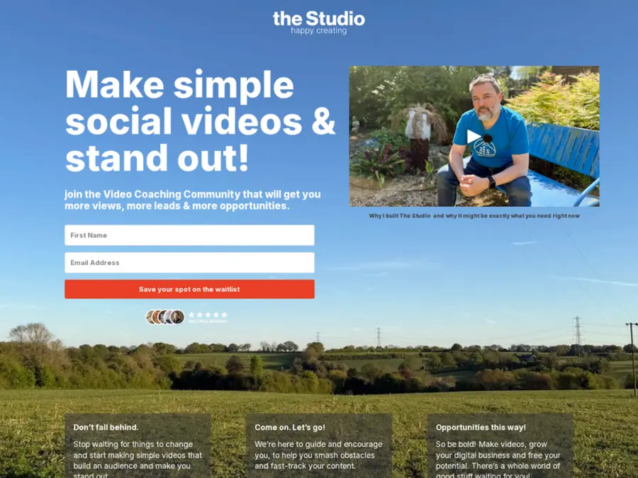
The current brandvideo.pro homepage hero
Where it is now

Full-bleed countryside, Inter 800 in white, orange-red button. The instinct is right. It's the execution, the weight and the structure underneath that need work — so none of these directions throw the look away.

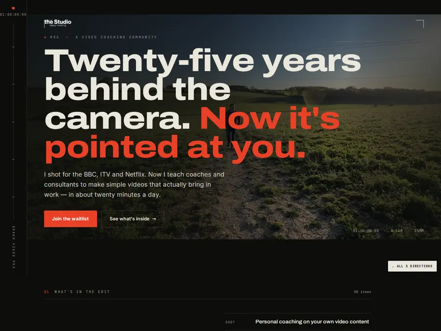
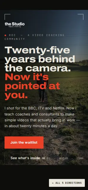
Direction 1 preview: dark cinematic layout with a timecode rail Mobile view
Direction 01

Rushes

The edit suite. Leads with the 25 years.

Dark, cinematic, laid out like a timeline. A timecode rail counts up the left edge as you scroll, sections are numbered like clips, the hero is letterboxed with viewfinder marks. It argues that Chris is a broadcast professional, not another content guy.

Type
Archivo (expanded) · Inter · JetBrains Mono
Palette
Best for
Corporate training days, premium positioning
Risk
Coolest of the five — least warm
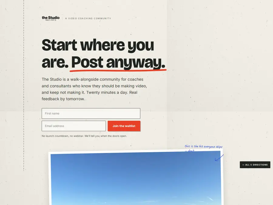
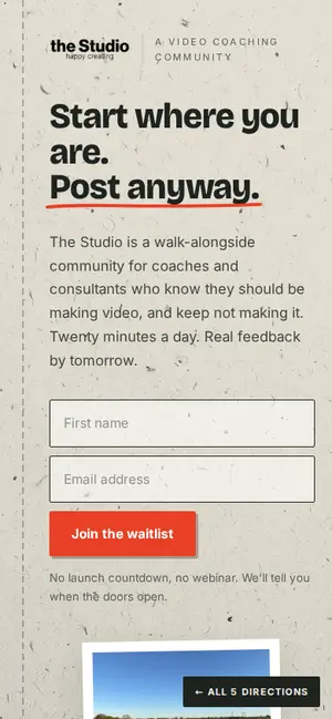
Direction 2 preview: paper texture with handwritten annotations Mobile view
Direction 02

Field Notes

A walk with a notebook. Leads with the warmth.

His recycled-paper texture and ink become the whole system. A dashed footpath runs down the page with waymarker stakes at each section, photos are taped-down prints, and handwritten notes sit in the margins. The friendliest of the five, and the most obviously his.

Type
Bricolage Grotesque · Inter · Caveat
Palette
Best for
The membership — nervous, not-a-natural-on-camera buyers
Risk
Craft look can read as less premium
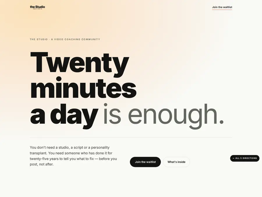
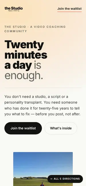
Direction 3 preview: huge Inter type on warm off-white with a photograph below Mobile view
Direction 03

Golden Hour

Restraint. Leads with the photography.

His exact background colour, Inter only, set at a scale he isn't using yet — and then the photographs given real room. One effect on the whole page: a warm light that tracks down and across as you scroll, like the sun setting over the content. This is his current site done properly rather than replaced.

Type
Inter alone, 400 → 900, extreme scale contrast
Palette
Best for
Everything — it's the safest strong answer
Risk
Needs good photography every time, no hiding
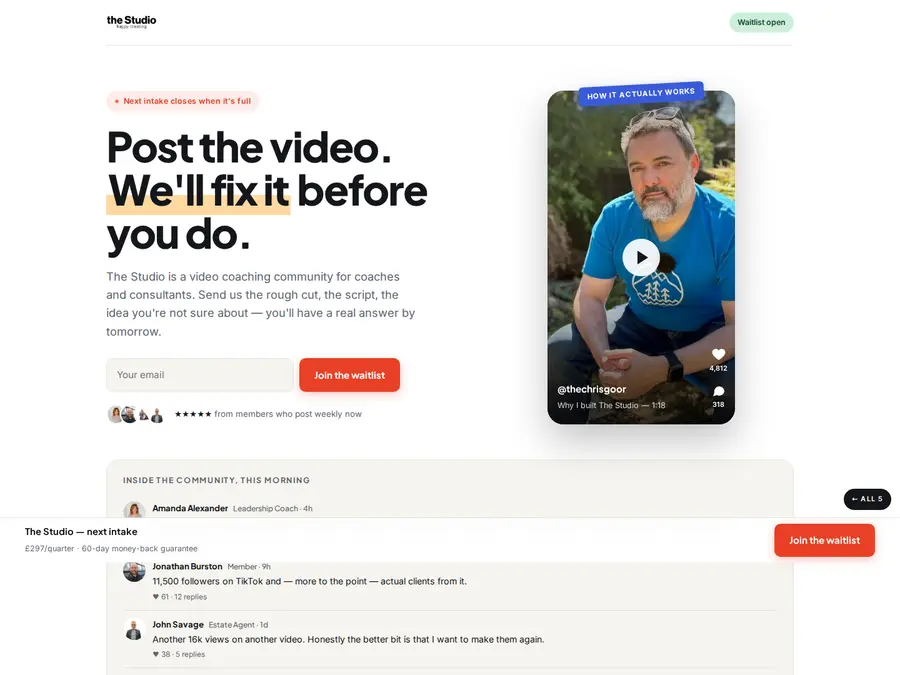
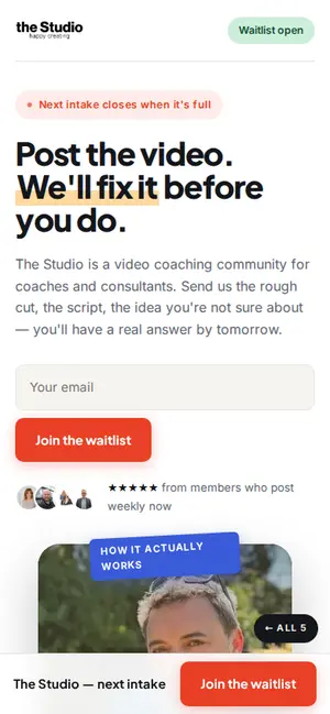
Direction 4 preview: a vertical reel card beside a comment thread Mobile view
Direction 04

The Feed

Social-native. Leads with proof and conversion.

Built for the 120K followers arriving from a phone. The hero is a 9:16 reel card next to a live comment thread from inside the community; a sticky join bar follows you down the page like an app. The most direct-response of the five and the one most likely to convert cold Instagram traffic.

Type
Plus Jakarta Sans · Inter
Palette
Best for
Paid traffic, link-in-bio, waitlist pushes
Risk
Looks like a funnel — furthest from his gentle tone
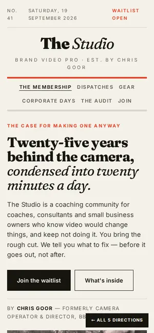
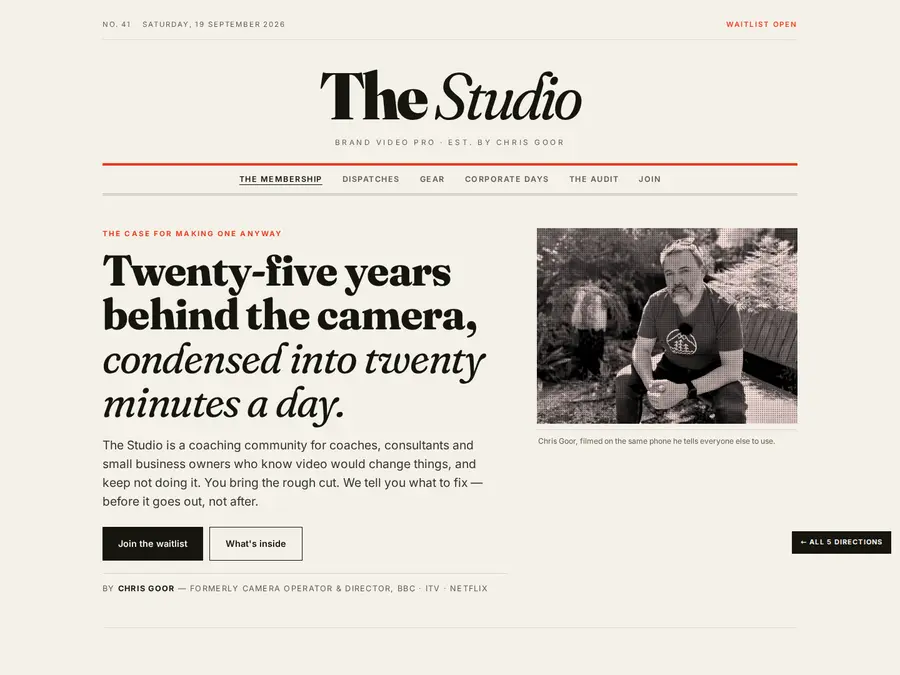
Direction 5 preview: newspaper masthead with serif display type Mobile view
Direction 05

The Masthead

A publication. Leads with authority and the SEO play.

Answers the "blog is one post" finding directly by making writing the point of the site. A real masthead with issue number and date, broadsheet columns, and his photographs run through a halftone print treatment. Fraunces gives the authority his broadcast CV deserves.

Type
Fraunces (variable, soft + wonk) · Inter
Palette
Best for
Long-term organic growth, corporate credibility
Risk
Only pays off if he actually writes

What I'd do

Direction 03 “Golden Hour” as the site, with Direction 05's Dispatches section bolted on as the blog. Golden Hour keeps everything Chris already gets right and fixes the execution; the Masthead treatment gives the writing somewhere credible to live without turning the whole site into a newspaper. Direction 04's sticky join bar is worth stealing regardless of which look wins.

If Chris wants one thing that no competitor can copy, though, take Direction 01. Nobody else teaching video online has twenty-five years of BBC and ITV behind them, and it's the only direction that makes that the headline.

Next

Pick one and I'll build it.

The build is Astro on brandvideopro.matewishkey.com, scaffolded from the rider starter — static HTML, images served as AVIF/WebP at the right size, video as a poster image with click-to-play. That alone takes the page from 79 MB to well under 1 MB.

  1. You pick a direction — or tell me to mix two, which is what I'd expect.
  2. Two decisions from Chris: does the AI crawler block stay or go, and do we keep /join-now and /join-soon as separate pages or collapse them into one.
  3. I build it with a title and description on every page, one H1, alt text on every image, Organization / Person / Course / FAQPage schema, a sitemap that includes the homepage, RSS and llms.txt, and the funnel stubs set to noindex.
  4. We re-run this exact audit against the new site and put the two score tables side by side.